
Thursday, 18 January 2018

Evaluation question 2
Evaluation question 2
Below is my response to the question, in the form of a website I made using Wix

Tuesday, 16 January 2018
Magazine and poster final Drafts


Here are the final drafts for both my magazine and theatrical poster.
Extra
On top of this I worked on making a teaser poster , Although I didn't spend as much time on it. I thought it was good to create and consider as it would be a poster product around it. so here an idea of what I would want a teaser poster to look like ( with more editing and time spent on it ).

Trailer feedback
Not only did I get Feedback on my poster and magazine , I used the same method to get some feedback from social media. I went back to the group chat once the product was made and sent them a link with some basic questions about the product.


After this I got some responses from participants here is a collection of some of the responses.

From this I can see that the product I have made is successful , people get the "uneasy" feel setting it away from the scary side which is associated more with horror films. Meaning its more likely to come across as a thriller. There is feedback on things I picked style wise like a lack of a narration which I think works with the trailer but as of the feedback I think next time I would try and make a copy with some narration just to make sure that it wouldn't be better, I wouldn't know because I didn't try it so that feedback has made me realise that I need to test things and meet dead ends just to guarantee it wouldn't make the best product.
Other things I learned was that the issue of dialogue and speech was raised. I agree as I watch back over it there lacked conversation ( although this helps set a mysterious tone) some people saw this as lacking context and information to the trailer and I understand and take that into consideration. Also the sound was not a loud or was too loud in some places and I would look more into focusing on sound because when I first started editing I mainly looked at lighting and transitions and not sound so I would make sure I spend enough time on this and work it better into my editing time schedule.
Wednesday, 10 January 2018
feedback
For my poster and my magazine I have decided to get feedback from my intended target audience, to do this I have researched into methods of feedback. I can then take the feedback and work on what they have said to improve the products to provide a magazine and poster that will appeal more to the audience.
Here are some methods of the feedback that I can use to gain some information about how the audience feel about my product.


 These are the images the audience was shown.
I decided on the method of picking a group of people and pulling them into one chat One reason I picked this method as of the development of technology within society and the roles it plays plus the target audience is likely to use and get a large influence from social media. It also gives people a chance to look over and even compare to other posters. There is less pressure and it keeps them relaxed so ideas can flow and criticisms and positives can build from each other.
Some issues is that ideas may be vague or not explained properly. And some members of the group may speak more than others but I can still easily draw information from the feedback to work on my poster and magazine.
I arranged a group chat with some people I know who fit the target audience, they are going to remain anonymous. I added them to a group chat together and then sent the images of my magazine and poster. After some conversation I then sent professional magazines for some comparison so they could help give me feed back.
Here is the feedback that I got from the group
screenshots from the chat are below. The first image was the magazine and the second one was the Poster.
From the feedback I found that it was pretty much interrupted how It was meant to be. With people understanding the idea of the poster being blurred/ like double vision.


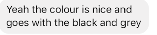


Poster criticism
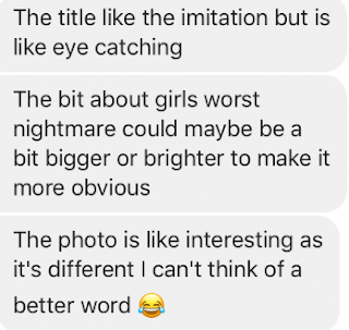

Magazine criticism

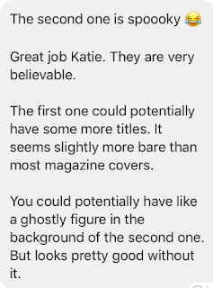

I also had the general criticism to make sure I check my spelling and gramma.

what I learned
what I learned from this is that the Poster has the desired effect it looks more creepy/spooky than horrifying. which is what I was going for when making the poster. It was also mentioned that the effect on the poster of the main character was done well and that it looked nice because she didn't lose her overall form. The poster sticks to an effective colour scheme and that commented on. The criticism of the poster was that some of the smaller text may not stand out as much as it needs to such as the "A girls worst nightmare" as it has the same triple effect but may get over looked.
corresponding to the feedback I am going to make some minor changes however if they are effective then I may change it back.
On the magazine they some of the group enjoyed the final details such as the film reel on the Name of the magazine. They like the colours which are used as they are bright and eye catching. And said that magazines usually have a lot of information and that my magazine cover should have more information so I will make that change as I have looked at this and decided I agree and it is one of the key changes.
update
after fully finishing all my products I made a questionnaire about the overall effect of my products as a package.
https://www.surveymonkey.co.uk/r/XCVG28X
Here are some methods of the feedback that I can use to gain some information about how the audience feel about my product.
- Survey/ questionnaire - I can provide them with a way to give short and long answers to questions. Having them select what they like and what they dislike and having long answer questions so they can tell me what they would want improving and what I should defiantly keep.
- focus group
- interview
- social media
- reaching out directly
Some ideas I have had is mixing social media with direct reaching , Such as sending through a platform of social media or communication technology the draft of the poster of magazine I can then gain feedback from what they say. It gives them long enough to look at it.


Or I am going to interview and ask for direct feedback so that I can then in a video pull out the feedback and talk about what has been said and how it will impact my choices.

I decided on the method of picking a group of people and pulling them into one chat One reason I picked this method as of the development of technology within society and the roles it plays plus the target audience is likely to use and get a large influence from social media. It also gives people a chance to look over and even compare to other posters. There is less pressure and it keeps them relaxed so ideas can flow and criticisms and positives can build from each other.
Some issues is that ideas may be vague or not explained properly. And some members of the group may speak more than others but I can still easily draw information from the feedback to work on my poster and magazine.
I arranged a group chat with some people I know who fit the target audience, they are going to remain anonymous. I added them to a group chat together and then sent the images of my magazine and poster. After some conversation I then sent professional magazines for some comparison so they could help give me feed back.
Here is the feedback that I got from the group
screenshots from the chat are below. The first image was the magazine and the second one was the Poster.
From the feedback I found that it was pretty much interrupted how It was meant to be. With people understanding the idea of the poster being blurred/ like double vision.


Poster criticism


Magazine criticism


I also had the general criticism to make sure I check my spelling and gramma.
what I learned
what I learned from this is that the Poster has the desired effect it looks more creepy/spooky than horrifying. which is what I was going for when making the poster. It was also mentioned that the effect on the poster of the main character was done well and that it looked nice because she didn't lose her overall form. The poster sticks to an effective colour scheme and that commented on. The criticism of the poster was that some of the smaller text may not stand out as much as it needs to such as the "A girls worst nightmare" as it has the same triple effect but may get over looked.
corresponding to the feedback I am going to make some minor changes however if they are effective then I may change it back.
On the magazine they some of the group enjoyed the final details such as the film reel on the Name of the magazine. They like the colours which are used as they are bright and eye catching. And said that magazines usually have a lot of information and that my magazine cover should have more information so I will make that change as I have looked at this and decided I agree and it is one of the key changes.
update
after fully finishing all my products I made a questionnaire about the overall effect of my products as a package.
https://www.surveymonkey.co.uk/r/XCVG28X
Tuesday, 9 January 2018
Sunday, 7 January 2018
Trailer choices
In my trailer many of the choices made so i have decided to explain and talk about some of the choices I made while shooting shots , costume and location.
- The opening shot is a close up of a window while its raining outside, I picked this as the dark weather and the connotations of rain set the sad feel but also it lacks meaning and understanding which means the clip isn't essential to the story but brings a mood which i thought was a good way to introduce the trailer
- I have decided a lot of fade to black shots as its dark and in a way could be used to signify meeting a dark end but also the blinking of characters such as Jayne watching Nikita.
- We see Nikitas character at the graveyard but before she zips up a black hoodie. I picked this choice as its meant to symbolise her character that she is usually laid back and dresses to be comfy. However the Dark hoodie in a way is meant to show her feelings and the action of zipping is to show her closing her self off. It signifies her change and shift in personality. The dark colours show that its negative and probably won't benefit her as a character.
- We see both the friends coping with the death in there own way. The clips are meant to show the difference in them. One of them looks at stuff and is interested in remembering them where as the other silently just thinks. The lack of the morning together is meant to show that there is tension or something keeping them from comforting in each.
- When we see the funeral program I picked for the image used to be the girl in her uniform to give the image of there age , these are school student and to highlight the character died innocent and young.
- When we first meet Jayne we don't know her name , we don't even see her face we just hear her voice , it leaves the mystery of who she is and what she looks like. This is done as we don't know who she is and in effect neither does she , she tries to become someone else and is desperate for someones friendship. The fact we don't see her face is so the audience doesn't know who she is like she doesn't know who she actually is.
- The beginning of the trailer is meant to highlight the strains on Nikita and Marias friendship, thats why we see them argue and we see them not speaking with each other. This isolation and fear of being alone drives nikitas character to look for someone else. Jaynes character wanted this to happen and everything has subtly involved her like there arguing and maria even puts some blame on her over There dead friends death.
- Later in the trailer I choose to use some fast pace editing with shots which jump between each other included with music which meets a high/ peak at moments we see Jayne. The clips show things that are ordinary, getting rid of medications , alcohol and a funeral program of a girl she's not even friends with. It is to build suspicion the lack of dialogue around her being invested in there life is so that it doesn't give to much away.
- We know Jayne isn't as nice as she says she is like some of the character hint however Nikita doesn't which causes suspense to build which helps it fit the convention of a thriller building up for the audience to anticipate the fate of the character for not knowing. Thats why I decided to have a clip which main focus is Nikita as we hear her innocence with little concern in her new friend which we know nothing about and has hardly scene. It cuts to something about Jayne which shows Nikita was wrong and then back to Jayne listing and being suspicious. This editing is meant to reflect the now worsting situation and how soon this may escalate.
- We know the friend died and Maria aka amy went missing and that its important to the plot line so the reference to weird things happening around Nikita means we know she's the main character and that soon violence or a problem could effect her. The shots of Nikita losing trust in the only person she has such as finding evidence of something strange going on, now puts the audience in the same place as her fearing for her safety. Helping the audience worry and sympathies with the character
- The end of the trailer is meant to leave people on edge , caring what happened to the main character to make them want to watch the movie so they can find her fate. we then see A hand grab Nikita. This then blacks out at the end not giving the audience more of a result.
- The idea then to cut to the information on the film works as it gives audience more to the story as We see Nikita wake up. They continue to watch to gain as much information as possible and this is when the key details are put so that the audience now have the important information so they know when they can go see the film.
- Costume for each character was done specifically
- Jaynes character wears dark clothing and stuff which may symbolise danger, In one of the shots including her character she wears a red top with Skulls to symbolise death and the red as danger her edgy style is meant to show she may be a bit of an outcast compared to everyone else.
- Other outfit choices for included a vest top, this was when she pulls at her hair make up smudged clearly having a break down, her clothes are at simple minimum to resemble that she is bare that her personality is being worn down. This is truly is and no clothes or accessories are covering up her true self.
- Nikita character is laid back and not so emotional, he clothes are for comfort and not for style , hardly any make up and her hair isn't done up. Its meant to show her character and how she is just trying to get by , she's simple and realistic. her clothes aren't meant to show to much other than are meant to show her as the kind of character she is.
- Maria's characters style is more girly however are bold and highlights her personality also we can see she isn't scared to get her point across when she's blunt about not trusting jayne and her clothes are meant to tell us this about her.
- Settings where picked for Filming purposes because of there easy access but also relevance and importance to the story.
- the school- this is a social place which brings happy memories to most however as some bad things happen here it takes that away from Nikita as well she no longer has school as a safe place with her friends as they have left her. She is losing everything. The school is used as a time where people have to talk and this sparks plot points such as Nikita finding out about maria being missing and having to talk with her
- Home- this place has a warm meaning and a feeling of safety. Nikita leaves her home to make a call about Jayne to anyone who will listen. she flees the place she is meant to be happy. Highlighting the fact she isn't safe any where. Jayne has slowly invaded all of her life taking everything away. In a shot we see her looking out her window scared from a rather strange angle this was filmed this way as it is to hint she is being watched from her garden which is part of the safety of her home
- The shed- a dark small space with nothing to show meaning , it has no significance to a person it is a dark unknown place like the fate which is being shown for Nikita.
- The street- we see jayne and Nikita talk this gives Jayne hope of having a friend that people know about a street is a very public place. The street resembles the connection Jayne has with reality. She is only there for a few seconds we only see them in public once when they first meet.
- Outside ( when nikita makes a call ) this is to show she isn't safe anywhere so she escapes to an unknown location, its quite and hidden as if she feels like she can't be found.
- I also wanted to add some green screen and edit it so maria fades out a shot as this will add to my skill and also will add to the realist feature of a trailer. This will be something which I will have tried and we look into however may not make the final cut if it doesn't look professional.
- Colour is key in many aspects of development through this and my ancillary tasks it adds to synergy and the general look of the product. The purple colour and the font are a signature to the trailer and link them together however the blue in the magazine is because its a different product meaning it may not follow the same colours however I made sure to have it consistent in the trailer and poster
- Sound is another key aspect and after a wide range of editing i changed the over all sound of the trailer. it was much lighter to begin with as when i first started editing it I was making it as A Drama , I have no picked music which peaks with high sound to match high tension/ suspense clip and has a more sister tone however not horror as this is not the genre. Fixating on the fact my trailer is a thriller and not a horror is key. I keep this in mine with many of the choices I make this is why there is a lack of weapons and Blood ect.. as that doesn't add to the myster confusion and suspense that I am trying to create.
Wednesday, 3 January 2018
my production titles
I have made two company production titles using after effects. One called lime light productions and one called flash studios. It has took me a long time to achieve what I have made. The first title I made was a Flash studios. It comes up on screen and flashes for a few moments before setting down with just the name. This helped me learn the basics.
Here is some details on the the first title I made. I did some testing with colour levels keeping the test simple and the animation. Here are some screenshots of how it changes.

 I may make a few minor changes to it as i would like it maybe to be larger or more centred however they shouldn't take me to long. So i will work on them when they are needed for the final draft

The second title I did was more complicated I had to use a range of tools I didnt even know where real. I had to make a camera , light and shapes which some of these aspects I knew where part of the software but I hadn't previously accessed them while doing skill development or my first title. Here are a list of things i had to do to make the title.
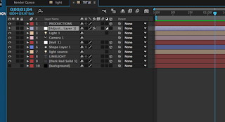

Here is some details on the the first title I made. I did some testing with colour levels keeping the test simple and the animation. Here are some screenshots of how it changes.


The second title I did was more complicated I had to use a range of tools I didnt even know where real. I had to make a camera , light and shapes which some of these aspects I knew where part of the software but I hadn't previously accessed them while doing skill development or my first title. Here are a list of things i had to do to make the title.

- create text
- Add a 2 light layers
- use solid layers
- Use the shape tool
- make a Null object
- Make an adjustment layer
- edit curves
- use radial fast blur
- Add shadows
- change colours
- 3D layers
These where some of the options I used to create it. I messed around with it in-between to get familar with the software and after a couple hours here is a screen shot of what it looks like.

I am not 100 % happy with it and are going to make some changes and develop it future in my opinion the its a little blurred and there needs to be some action as I all have made it do is make the light start off and then turn. There will be an updated version as a video. I would like to change the colour of the light/ circle in the background to make it look like its making the text that colour.
Will be updated
Will be updated
Monday, 1 January 2018
Music/ sound
For my trailer i used a range of royalty free music and also tried to create some sounds my self. I may have made them however this doesn't mean that i used them within the trailer however a compilation of the sounds i created will be bellow and if used will be mentioned.
Also here is there I discus my music and sounds choices plus where i got them from and more.
The main websites I used for sound and music was Bensound , freesound , purple planet and No copy right sounds. All sound effects and music came from either of these sights.
I also used free sound for many of the sound effects so all credit goes to those creators and I am thankful for them allowing the use of the sounds.
Heartbeat sound
https://freesound.org/people/thenudo/sounds/146765/
Church bells
I decided to have the sound effect of church bells as the beginning to help high light there has been a death and a tragedy within the community. With each edit there comes a corresponding chimed bell. I got this sound from Klankbeeld on Freesound.org, the link will be bellow.
https://freesound.org/people/klankbeeld/sounds/343419/
Here are the sounds I downloaded although I didn't use all of them. I appreciate the peoples hard work as they have put a lot of effort into creating sounds. Without them the trailer wouldn't have the same atmosphere and sounds
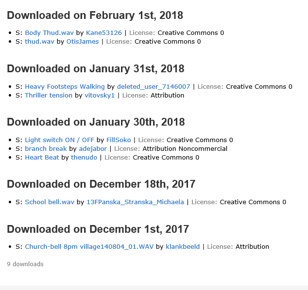
I also used some music from http://www.purple-planet.com/
Here are some sounds I created my self which I considered adding into my trailer. I decided on trying some sound effects like footsteps , breathing , and loud thumps sounds which could be used as hits or even the heart beat sound I used in the trailer
Also here is there I discus my music and sounds choices plus where i got them from and more.
The main websites I used for sound and music was Bensound , freesound , purple planet and No copy right sounds. All sound effects and music came from either of these sights.
I also used free sound for many of the sound effects so all credit goes to those creators and I am thankful for them allowing the use of the sounds.
Heartbeat sound
https://freesound.org/people/thenudo/sounds/146765/
Church bells
I decided to have the sound effect of church bells as the beginning to help high light there has been a death and a tragedy within the community. With each edit there comes a corresponding chimed bell. I got this sound from Klankbeeld on Freesound.org, the link will be bellow.
https://freesound.org/people/klankbeeld/sounds/343419/
Here are the sounds I downloaded although I didn't use all of them. I appreciate the peoples hard work as they have put a lot of effort into creating sounds. Without them the trailer wouldn't have the same atmosphere and sounds
I also used some music from http://www.purple-planet.com/
Here are some sounds I created my self which I considered adding into my trailer. I decided on trying some sound effects like footsteps , breathing , and loud thumps sounds which could be used as hits or even the heart beat sound I used in the trailer
Thursday, 14 December 2017
Production log magazine and poster
To make the magazine and poster I used photoshop. I used my sister who is the villain within the project as the photography. However i made them differently. Especially as the film and plot of the trailer changed. I also used this to mark what I have learnt and what skills I have developed while editing and how my photoshop skills have improved.
Magazine
poster
Magazine
poster
Wednesday, 13 December 2017
First draft trailer
I have made my first draft for the trailer, as I have noted down editing choices and if extra clips I will need to complete it. As I don't have much previous experience the first draft has very little editing using default transitions. However I am going to do some research and have some ideas.
One idea I have is to use the clip I have of Maria and Nikitas character in bed and then make Marias character disappear/ fades out. As if she has left the characters life.
One of the other main editing choices I have decided to do was have it so that some of the transitions come across as blinking to give it an ere effect as it is meant to be a psychological thriller. The music is meant to all have this effect and has already been effected. Having darker colours and adding that to the trailer will help add that darker feel to the trailer. I still have some editing research to do to get and idea of what editing choice I will make for the final draft.
One idea I have is to use the clip I have of Maria and Nikitas character in bed and then make Marias character disappear/ fades out. As if she has left the characters life.
One of the other main editing choices I have decided to do was have it so that some of the transitions come across as blinking to give it an ere effect as it is meant to be a psychological thriller. The music is meant to all have this effect and has already been effected. Having darker colours and adding that to the trailer will help add that darker feel to the trailer. I still have some editing research to do to get and idea of what editing choice I will make for the final draft.
The music and the majority of the clips are selected so now its more the putting them together and making any changes or extra filming that I will need all though i don't think there will be much of that needs to be done.
below is the first draft of the trailer
Here are some things I am going to add to the trailer
Here are some things I am going to add to the trailer
- A few short scenes of images like burning ect
- more of an establishing conversation
- change in music/ sound + more sound effects
- re film one or two shots
Thursday, 7 December 2017
production title
At the beginning of any trailer a series of things come up which I have previously explored and researched with my convention research. This gives me what I know need to know to make an effective production title. Many big companies will have spent a lot of time and money on making there production title. That is why when we see them we can relate it to good editing and a good film and be more likely to watch it.
However indie companies are a little different and will have a production title as well that will represent them although less money would be put into none the less. However for my trailer i have decided to base the production company as an indie one so it means it gives me a chance to explore and develop my skill using different software such as after effects as this will benefit my product in other areas such as having on screen text through put the trailer. It means i can learn about the software and can effectively incorporate that into my work. I did some skill development before hand with very basics such as making new compositions and ect however I needed to future that to make a production title.
some key thing I learned
However indie companies are a little different and will have a production title as well that will represent them although less money would be put into none the less. However for my trailer i have decided to base the production company as an indie one so it means it gives me a chance to explore and develop my skill using different software such as after effects as this will benefit my product in other areas such as having on screen text through put the trailer. It means i can learn about the software and can effectively incorporate that into my work. I did some skill development before hand with very basics such as making new compositions and ect however I needed to future that to make a production title.
some key thing I learned
- many trailers have audience requirements which tells us what audiences they have been approved for to view.
- Commonly the music which intorudeces the trailer will begin while the credits role
- there can be more than one production company involved
- it can either be at the start of after some par of the trailer goes.

For my own trailer I may not use All audiences as it may have some mature themes as it is a Psychological thriller.
Friday, 1 December 2017
Thursday, 23 November 2017
Last filming days
as of the changes that I have had to make to the media product I have had to do some extra filming however I am still using some of the footage I had previously. So over the a couple days I did some clips to add to the changes and fit some footage in with the new genre so that i can edit it and start to form an out look for the trailer.
As my trailer started as a drama it has this kind of peaceful sense and after researching thriller genre i know that a key aspect is a disruption of peace and so that's going to be the beginning of the trailer the normal life and then its going to introduce the problem later on.
However over a weekend period I did some more filming with the new character and I have changed the secondary character to the main character which means I had to get some more footage. The location was the same I used a shed in my garden and then my bathroom and sister bedroom as the other locations for the filming so I don't have locations to update however I may have to add some about the Church i used to show the scenes of being at a funeral or at least morning the death of a friend.


The weather on both days where clear weather which doesn't really match the darker vibe I was trying to bring across however it made filming clear and if needed I can do some colour correction to the footage.
 The shed I used as the darker setting is on the side of my house. I used it as a dark small confined area for the main character to end up after she is grabbed.
Here are some shots from the filming process Nikita was the secondary character however I have changed her role within in the trailer as I've changed ideas and inspirations. Here are some shots from some of the filming that we have done.
This is the last scheduled filming shoot, as I believe i have the footage to make it however if we need to re film I have allowed time for the after I have started putting it together.
As my trailer started as a drama it has this kind of peaceful sense and after researching thriller genre i know that a key aspect is a disruption of peace and so that's going to be the beginning of the trailer the normal life and then its going to introduce the problem later on.
However over a weekend period I did some more filming with the new character and I have changed the secondary character to the main character which means I had to get some more footage. The location was the same I used a shed in my garden and then my bathroom and sister bedroom as the other locations for the filming so I don't have locations to update however I may have to add some about the Church i used to show the scenes of being at a funeral or at least morning the death of a friend.

The weather on both days where clear weather which doesn't really match the darker vibe I was trying to bring across however it made filming clear and if needed I can do some colour correction to the footage.
The shed I used as the darker setting is on the side of my house. I used it as a dark small confined area for the main character to end up after she is grabbed.Here are some shots from the filming process Nikita was the secondary character however I have changed her role within in the trailer as I've changed ideas and inspirations. Here are some shots from some of the filming that we have done.


This is the last scheduled filming shoot, as I believe i have the footage to make it however if we need to re film I have allowed time for the after I have started putting it together.
Magazine
I now have some photography for my magazine and have started to process of refining from my draft my final copy.
After changing the colours I still have some of the same text , i have been changing the text and the colours testing what works and what doesn't to find an effective colour scheme which works with the magazine. i like the idea of having pinks and reds as these link to the girly theme of the drama and then which can now fit the thriller.
For the photography I have picked to use the Villain as such the character isn't a villain and is miss understood , they feature on the poster and the magazine as this character and her mental state is the key focus of the film. so she is the key and main focus of the poster.
through trial and error I have come up with these drafts. I now have a costume which matches the colour theme plus photography which works. having her finger to her lips is to resemble silence or to keep her bad side a secret. The character comes across as nice however isn't and this is meant to resemble that. Compared to the poster she has no make up and the make up and none make up was a choice to represent the characters different sides. Dark lips and a full face of make up is maybe used to be a mask covering her old self and to resemble her new self.
I like the positioning of the image and the blending i used to make it met into the background , I also edited the photo slightly. The shot which is a portrait of the person is eye catching as she makes eye contact with the camera and she has a very piercing eye colour. I also like the red pink colour scheme as it matches the outfit.
However it still isn't fully complete.


Changes which need to be made after this draft
 However i don't like the edge of the photo and may wish to change this as it would improve the over all look. The photography is meant to be one of the key elements which draws the attention of the readers of the magazine. i may try the magazine with some different photography.
I like the colour added to it as it gives it more of a meaning and it adds to the magazine. however I think that the blue takes away from the image. I picked this photography as it was a medium shot and had the head and shoulders of the actress and this was common when I looked into research so it must have some attractiveness and must be an effective style of photography used in the magazine.

To gain a better understanding of what the audience want I am going to do a focus group so that I can get feedback from the intended target audience.
After changing the colours I still have some of the same text , i have been changing the text and the colours testing what works and what doesn't to find an effective colour scheme which works with the magazine. i like the idea of having pinks and reds as these link to the girly theme of the drama and then which can now fit the thriller.
For the photography I have picked to use the Villain as such the character isn't a villain and is miss understood , they feature on the poster and the magazine as this character and her mental state is the key focus of the film. so she is the key and main focus of the poster.
through trial and error I have come up with these drafts. I now have a costume which matches the colour theme plus photography which works. having her finger to her lips is to resemble silence or to keep her bad side a secret. The character comes across as nice however isn't and this is meant to resemble that. Compared to the poster she has no make up and the make up and none make up was a choice to represent the characters different sides. Dark lips and a full face of make up is maybe used to be a mask covering her old self and to resemble her new self.
I like the positioning of the image and the blending i used to make it met into the background , I also edited the photo slightly. The shot which is a portrait of the person is eye catching as she makes eye contact with the camera and she has a very piercing eye colour. I also like the red pink colour scheme as it matches the outfit.
However it still isn't fully complete.


Changes which need to be made after this draft
- The writing context isn't fully relevant as it is from older copies and may need to be changed
- " a teen girls worst nightmare" is used on the poster so I want to change the phrase ( i predre it in the white colour)
- Add some more stories to the colour
- Add some detail/ texture/ shadow/ gradient to the plain black background to add to the photo ( although this needs to be tested)
- change the date to one of relevance
- Make sure text and images are all linked and work well together as well as specific things being over the top of other.
- I have also thought about changing the colour as the red and the dark purple/ pink colour don't seem to work to well together.
After some changed I decided to make this is what I have came back with after looking at the first one and seeing the blue colour i thought about using that and as purple is used in the poster there similar without being the same. The colours red white and blue work well together however could resemble america as a theme as its the colours of the flag and other movie icons such as captain america , however i thought it was a good mix of having a darker red which doesn't stand out to much with a mix of blues.
 However i don't like the edge of the photo and may wish to change this as it would improve the over all look. The photography is meant to be one of the key elements which draws the attention of the readers of the magazine. i may try the magazine with some different photography.
I like the colour added to it as it gives it more of a meaning and it adds to the magazine. however I think that the blue takes away from the image. I picked this photography as it was a medium shot and had the head and shoulders of the actress and this was common when I looked into research so it must have some attractiveness and must be an effective style of photography used in the magazine.

To gain a better understanding of what the audience want I am going to do a focus group so that I can get feedback from the intended target audience.
Tuesday, 21 November 2017
Poster draft 2
I wanted the same effect on my practice as I did on my photography so I looked into the settings I used for the practice. For the practice I duplicated the same image three times and edited each one a different colour.
Image one wasn't changed it was kept under the same colours and opacity however it was a black and white photo meaning I needed to make my photo black and white so I will need to edit the original photo.
Image two - here is the blending options I used for this image. With layer two I changed the colour opacity and added a purple overlay this gives it the purple colour which matches the title and theme of the cover however mixed with the other changes gives it a cool effect to add to the blurred and double vision look.


image three- here is the blending options I used for this image

Here is my first attempt with my own photography and looking at the image there needs to be some changes. The purple doesn't stand out beer well in the title because of the size of the image meaning I either need to make it smaller or use a different purple. The bottom one as it is blurred may need changing so it doesn't over lap with the blur and look of the photography. However I am pleased with what I have started other than the small changes I need to make.

Here are some trails I have made since the first try.


After looking at what I was doing I realised the I liked the effect of the second trial however I wasn't happy with how the photography looked now I had edited and changed the shape . I decided the solution to tis was to get rid of the image and then start from the beginning sorting the edges at the start and changing the colours then fining how I want them. from this I also realise that I need to the purple the to be on the clothes or it isn't visible ( at the bottom ) and that the title also needs some editing as there is still some white on the back text. The fact I like has four layer however the photography seems a bit squished where as trial 3 doesn't. So I am going to spend some extra time to achieve the perfect look with the original photo.

This is what I have come to now after some more editing and making the photo new. Using modify and boarder tools I blended the sides better however it isn't as blurry as I would have liked it to be so I shall move it. I like this cover and now all i am going to do is add to the credit bar and change where they over lap to come with a better effect.
The model looks into the camera and remains emotionless and the other layers of her are meant to resemble her mental conflict and other faces and personality. As you can tell from the name. it follows conventions well. It is simplistic and however holds a big message and some unanswered questions. The dark colours link to the under lying darker theme and how she is in the centre of the light suggests she does have good inside her. Like the background is the good fighting the darkness.

This is the draft with improvements , I have changed the black writing so in the middle so that you can't see white aspects to it, I added to the credit block and although this is pretty much the final draft I will tweet the positioning to make sure it is centred and lined up with an equal distance on either side. I also blended the shoulder better so that it matches the background more such as she coming out from the background. it also removes sharp edges.
The Poster is meant to have a dizzy effect as i used three layers of the same image, i used this to put emphasis on her different kinds of personality which you get a glimpse of in the trailer. The actress is also wearing make up which she doesn't do to much of in the trailer. As were introduced to her we don't see much of her face plus when we see her breaking down she has some make up on her face. This make up is meant to show her covering up her true self and create a new face such as such. That is the characters aim. She believes if she becomes someone else then she can get rid of all her problems and be someone else.
As mentioned I picked purple as the colour for its connotations of mystery, as the genre has this element its not meant to be clear what she suffers from or what she's doing, as the audience can drive to find out about that.
Image one wasn't changed it was kept under the same colours and opacity however it was a black and white photo meaning I needed to make my photo black and white so I will need to edit the original photo.
Image two - here is the blending options I used for this image. With layer two I changed the colour opacity and added a purple overlay this gives it the purple colour which matches the title and theme of the cover however mixed with the other changes gives it a cool effect to add to the blurred and double vision look.


image three- here is the blending options I used for this image

Here is my first attempt with my own photography and looking at the image there needs to be some changes. The purple doesn't stand out beer well in the title because of the size of the image meaning I either need to make it smaller or use a different purple. The bottom one as it is blurred may need changing so it doesn't over lap with the blur and look of the photography. However I am pleased with what I have started other than the small changes I need to make.

- Photo size
- Font colour
- edges of the photography need to be smoothed
- finish the credit bar at the bottom
Here are some trails I have made since the first try.


After looking at what I was doing I realised the I liked the effect of the second trial however I wasn't happy with how the photography looked now I had edited and changed the shape . I decided the solution to tis was to get rid of the image and then start from the beginning sorting the edges at the start and changing the colours then fining how I want them. from this I also realise that I need to the purple the to be on the clothes or it isn't visible ( at the bottom ) and that the title also needs some editing as there is still some white on the back text. The fact I like has four layer however the photography seems a bit squished where as trial 3 doesn't. So I am going to spend some extra time to achieve the perfect look with the original photo.

This is what I have come to now after some more editing and making the photo new. Using modify and boarder tools I blended the sides better however it isn't as blurry as I would have liked it to be so I shall move it. I like this cover and now all i am going to do is add to the credit bar and change where they over lap to come with a better effect.
The model looks into the camera and remains emotionless and the other layers of her are meant to resemble her mental conflict and other faces and personality. As you can tell from the name. it follows conventions well. It is simplistic and however holds a big message and some unanswered questions. The dark colours link to the under lying darker theme and how she is in the centre of the light suggests she does have good inside her. Like the background is the good fighting the darkness.

This is the draft with improvements , I have changed the black writing so in the middle so that you can't see white aspects to it, I added to the credit block and although this is pretty much the final draft I will tweet the positioning to make sure it is centred and lined up with an equal distance on either side. I also blended the shoulder better so that it matches the background more such as she coming out from the background. it also removes sharp edges.
The Poster is meant to have a dizzy effect as i used three layers of the same image, i used this to put emphasis on her different kinds of personality which you get a glimpse of in the trailer. The actress is also wearing make up which she doesn't do to much of in the trailer. As were introduced to her we don't see much of her face plus when we see her breaking down she has some make up on her face. This make up is meant to show her covering up her true self and create a new face such as such. That is the characters aim. She believes if she becomes someone else then she can get rid of all her problems and be someone else.
As mentioned I picked purple as the colour for its connotations of mystery, as the genre has this element its not meant to be clear what she suffers from or what she's doing, as the audience can drive to find out about that.
Subscribe to:
Posts (Atom)
-
 Textual analysis The perks of being a wallflower The perks of being a wallflower trailer Starts with an establishing shot ...
 -
 I have been working on a draft for the magazine , although I haven't done the photoshoot , i have decided on a colour scheme. The idea ...
 -
 Although this one is a TV show Through research I have found films with a similar genre to my own have been on the cover of...