Tuesday, 24 October 2017

poster draft 1

I have worked on the theatrical poster for the magazine. So far I have decided on the photography which will be used plus and idea for the colour scheme.

The image I have selected for the poster will be similar to this.

There are some changes I plan on making to the photo/ photography for the actual poster
  • I'm going to take it from further away ( long shot ) so that I can get a fully body image giving me the advantage to make use of costume and body langue to the best extent. The photo take shows the position I going to use I just need to make sure there shoes are capture in the photo.
  • costume may change now the colour is decided below is the colour scheme
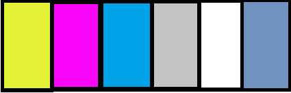
  • The costume will have to work with colours similar to these. The background is pastel yellow, the text is blue and features of text will probably be in pink
  • the costumes warn will be featured in the trailer and film as if its a quick snapshot from the film as that's what is meant to tease and show what the film has to offer
  • I have also had to decide the age of the film I am thinking a PG ,12,15 as its a teen film . it wouldn't have violence but it could have mature themes and swearing.
  • Using word and Agency FB i can also achieve a similar font and look as the credits at the bottom of poster as practice I found one from another poster and wrote it out. although for my own there will be different information this is roughly how i am going to make this to get this information on the poster. Although i may compress it as its key information however its not usually read by viewers as its more data protection, copy right and ect...
  • 
Here is the draft rough copies and ideas


 This was what i first created in photoshop using photography i had , evidently this won't be used as the image inset large enough for what I'm trying to achieve as they have no feet. However in the actual poster it will be full body and there feet will be on a shadow in the page a line to represent the floor. this will give the cover and photography dimension this will also work with the shadow of the summer of 17 text.

The text i decided is all capitals in a bright light blue. I picked this colour as it can represent the sky of summer but also relaxation and calming. In a way the blue is the sky and the yellow is the sun showing summer at its full. However the font may need to be changed to work with the rest of the poster.

I need to add a change in shadows and tone on the background so its not just a flat colour, this looks bland and not as good as it would with a range of tone and colour.

I like the colour scheme i am working with at the moment the bright pink ,  blue and yellow however i may need to add another colour in of the extra text.

Another thing i may need to change and add is layout as there isn't a large space at the bottom for information.


In addition i have had an idea for a teaser poster. For a teaser poster i was thinking of having a photo in the background in the out line of a relevant shape such as a pen, a drink or something summer related with either a black or white background. The writing however will be in a bright colour such as blue or pink and the only other information will be the release date.

Here is an attempt as the teaser trailer i had planned. I have decided on an image for the middle so i just used a picture of the sun and some blue sky. I also used the pen as an outline and i think i may need a better picture for that. However the curled writing is meant to represent the the hand writing. However this may not work with the real poster as they will have different Fonts and should probably be the same however its an idea i am going to look at and work on.


* updated*

Heres another idea I had for the poster after the change of the name. Through my research i have scene a range of photography used and some to go for the style of having a close up for the photo. so I've took a range of photos and tried both.

I think i may work on changing the colour scheme.


Wednesday, 11 October 2017

story board update

Through working on various planning information such as locations , props ,costume and starting my filming. I have decided on changes on the plot of the trailer. Over different periods of time my ideas have changed developing from sound , shots and more.

The story board its self has changed and many elements have been developed , described better. Over all my new ideas have helped my product improve and go on a journey based on a basic it idea from the teen drama genre to a narrative and story with a meaning and has development.

Onto of this there is more detail to the new storyboard and it has more features like ideas of onscreen text, and dialogue. which when i had made the first one was fairly undecided other than the fact that i would have it.

Below is an updated story board which contains information , on shots, sounds , editing and duration. Plus extras on dialogue , text and even ideas about the production log and title which i will be working on in the upcoming weeks.


Monday, 2 October 2017

filming day 6

before hand

On day 5 we have two locations of filming , which means a busy day plus costume, make up and props change. On the day i have filming to do at my house and my granddads house for them trailer as my house is a key location for a range of parts.

Here is what i intend to film at each location.

my house

  • The goodbye part in the car park out the back of the house - the two friends say goodbye to each other before departing for the rest of there lives at the end of the summer 
  • completing part of the list they find - tasks like drinking, ect 
  • The main character using a type writer , she wants to be a writer when she's older so we look into her hobby and how she wants to go to uni , they talk about how her friend would have wanted this 
grandads 
  • the two characters meet there friends guardian and he asks them if they would like her belonging and to watch a home video
  • they go to her room and find the list they wrote when they where children
  • them acting out and egging a building 

for either of this locations i might do them sat in a car practicing about learning to drive. 


on the day 2nd of October 2017

We started filming at 9:00 am when maria arrived. The first location was my house, in this we did a scene in the bar in my kitchen. For this it was a quick sequence with a medium shot of the actresses taking a drink. Plus a close up of the drinks.

I planned to film more however i changed my mind and decided not to rush it and do it on another day. So this was the only scene we got done in this location.


We moved to the second location at 10:30 which was my granddads house, and here we filmed a range of scenes. Although i planned to do three scenes i actually filmed a couple more

costume

today we had a couple changes of costumes. At location one we did one shoot and in this nikita wore an Adidas jacket and a red shirt. Maria wore a leather jacket and a plumb coloured top. I made them both wear darker clothes. I also made Maria wear a leather jacket as it gives the audience of an idea of trouble . The characters are doing something there not meant to and I picked there costumes to match this.

The second costumes was Maria in a plumb top as it a colour associated with the female gender and her character is meant to represent the stereotypical girl. where as I placed nikita in a purple shirt it still has a feminine colour but is more of a masculine style.

The third outfit was nikita in a green hoodie and Maria in a white top. The white top which had lace on the bottom was meant to represent her innocence and girly style. Where as nikita is meant to look more chilled. The dark colours and the casual clothes work to achieve this. Plus Nikita doesn't do anything to her its left down and untouched as its not something the character cares to much for where as maria has accessories and puts her hair in a pony tail

The last costume was another flannel shirt for Nikita and a blue jumper for Maria. These were just mean to reflect there personality. Using lighter softer colours for Maria, as well as it matches the bad weather
 

filming 5

On day 5 - filming and shooting

Today I tried to get some scenes from inside school done, finding time to film and getting people to film is proving harder however today I have hopefully got some shots I can use.

I have changed the plot so I was working on that ( on story board and animation there will be the updated storyboard) I am working towards an interaction after the cut at the house in the morning ,ill have a school bell ring and then have children walking or something. The we cut to the characters at school. this is the scene I filmed today . Marias character runs always from Nikita's as she doesn't want to explain how she's feeing like in the beginning narration

we also filmed a scene of nikitas character doing some art work which I want to include as an introduction to the character. I had to get another person to be in it as well and there model release form below on this page.

furthermore I tried to get a photo-shoot done for the magazine, it went okay however the weather was rather bad. the wind helped with getting a nice look of her hair however because of the weather the photo-shoot on the ground was a little off. however I have got some photos I can use. The clothes are better as it is a white patterned and a v neck with short sleeves. Make up wise is mostly natural with a more red lip stick I picked this as it contrasts the cover and can be a stand out feature


Friday, 29 September 2017

Magazine draft 1

For my first draft of the magazine I have used some of the photography i have already taken and added it to the page i have made.

 with what i have already done , I think the colour scheme works well. The mix of the light blue and yellow work well with the green background. The colours are all pale and more of a pastel colour which makes it seem softer or gentle. The colours fit the summer theme and also have some positive connotations which can apply.

The photography needs to be improved as it is the key aspect of the cover, this is the main representation and with the image I have used it doesn't have the best miss-en scene which is a huge factor of the effectiveness of the magazine. So I am planning to take a new photo, which has better costume and a background as the image was taken in the media studio and placed on a grass background so to get a more effective photo i am going to make the actress lay on the grass to get a better photo which will have a better and more effective effect.

To make it better I'm going to take a medium or medium long shot of the main character laying on the grass

Another thing I may change is the colour of the name of the magazine , it matches the colour scheme however i don't know if its bold enough. I have decided to have the main image over lap the title and it will be centred. This draws the readers attention to the main image however also shows of the conventions and key aspects.

I would also like to change some of the fonts as I believe some don't work. On top of that the final draft will be done more precisely. I will make sure all the writing and attributes of the page is lined up correctly after i have retaken the photo i intend to use.

For the first try i did have two main ideas. The first one was to have to two main characters together on the poster however after trying that i decided that i didn't like the space it took up. I wanted more space to fill in tagline and i wanted them to highlight the picture and not over lap it.


The two pictures above was my idea and i want to stick to a similar look however i would like to use a different photo for it. As i think it would work better than what i already have. 
 
This is roughly the colour scheme I plan to stick to


Further more I am planning to do covers , A main normal edition magazine plus a subscribers addition.

Obviously these are both from Total film , however they are very different in design. Subscribers addition has less information, on many copies of the subscribers edition there is the main image and the title plus some small extra information and the title. It doesn't provide as much information as the readers are already subscribed so they don't need secondary stories to draw them in. on top of this subscribed members most likely collect and these simple but effective covers may look better than ones scattered with writing.

The concept of having people subscribed to a magazine highlights the need and demand plus the popularity. It also can give a huge indication of the target and niche audience. One way it does this is the there is probably a fixed rate for the magazine and it suggests the audience are at an age which they can afford this. A subscription also may help get offers , exclusives and perks which keep and audience. Making a magazine cover for both shows the potential and what can be achieved.

Through some research I found what the total film description is described as understanding this helps me develop effective and magazines as i know what the target audience are looking for better. This includes all audience including people who subscribe to a magazine.


Wednesday, 20 September 2017

Title and production company

for the trailer i am going to have to create a title and a production logo and opening. To prepare my self for this i have taught my self the basics of after effects and plan on working on them. Here is the brain storm for the ideas.

Production company


  • For this I plan to name it related to fire, here are some words that may be incorporated into the company name, Flame , fire , blaze or smoke. 
  • The effects on this will be the letters either are on fire of set on fire 
  • The background will also have a look of partials floating around. 
Title 
  • The name of the film is summer of 17, it based through the summer before two friends go to uni and as they are finishing school , thats why i am using the school as a location and for the photoshoots 
  • I was thinking of having it look like a note book it being flicked and when you land to the final page, summer of 17 appears in block captains which looks as close as possible as letter used on items such as american football jerseys.
  • another idea would to have each work appear as if someone was writing it and having the font in a colour matches the poster ( i was thinking red as this is what is typically used to mark grades on tests ) 
  • Another idea would have it be stamped on  
  • The pages flick to represent the list 
  • Through out the trailer text will come up on screen this may look like type writing as the main character wants to be a writer or in scrawled writing which might match the title hand writing. Either way it will be consistent and work together 


The Brief

i have decided to do the movie trailer.  This includes.... A promotion package for a new film, to include a trailer, together with two o...